


無所畏懼拳擊館 | 品牌視覺設計 Visual Identity design
― 設 計 理 念 ―
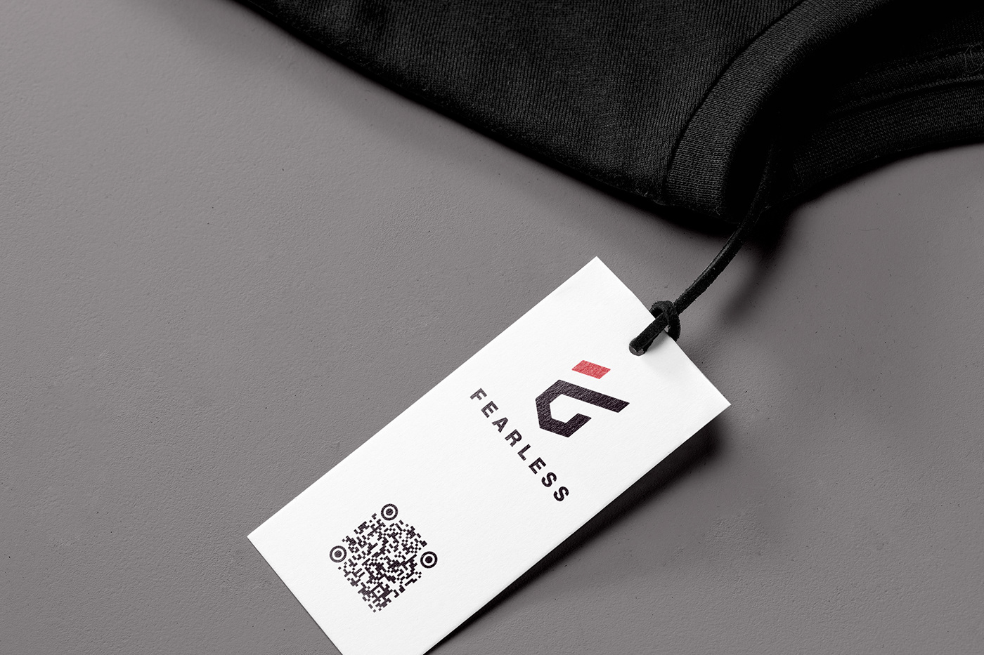
嘉義(Chiayi)代表C,是我們的根,也表示我們將Carry起嘉義的拳擊運動熱潮;我們無所畏懼、我們熱愛拳擊,我們所揮出的熱情,燃燒的每一低汗水,如同炙熱的火拳,打破未來的每一扇門,成為嘉義拳擊的領頭羊。運用圖地反轉手法設計,將含意融入火焰的拳擊圖標之中,與有著強勁爆發力的書法標準字體做結合,中西風格一比一的融合,格外恰當,讓充滿品牌視覺充滿力量。


Thank you
客戶 Client / 無所畏懼 - 拳擊館
專案 Type / 視覺識別系統 Visual Identity System
製作 Production / 巢弄設計 Chau Nung Design
標誌 Logo Designer / O.Dei Lo
識別 Visual Identity Designer / O.Dei Lo
標準字 Typography Designer / 莊承憲
專案 Type / 視覺識別系統 Visual Identity System
製作 Production / 巢弄設計 Chau Nung Design
標誌 Logo Designer / O.Dei Lo
識別 Visual Identity Designer / O.Dei Lo
標準字 Typography Designer / 莊承憲
FaceBook : https://www.facebook.com/WooouCN/


